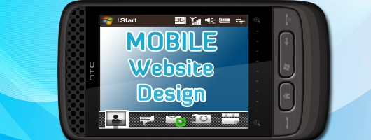
This is the Guest Post by PixelCrayons India. If you are interested in writing for us then check out the details here.
“The trend now is to get away from stage bound sitcoms.”</b
lockquote>
And, if we talk about the world of web designers then, changes are mandatory and bound to happen. Because “a market is never saturated with a good product, but it is very quickly with a bad one.”
There is no doubt to the fact that the area where there has been witnessed a lot of change are the website design trends. Also,“Compared even to the development of the phone or TV, the Web developed very quickly.”
Since the use of mobile phones have become prime, and the effective means to go online. What can be the reason? Is it just a trend, or that the computer systems are costlier and the weak broadband networks.
On a very general note, how many people you know who surf Internet on the mobile phone? A lot, I guess…! It is becoming an increasingly important element and, a recent research proves the same. It has been estimated on the facts almost 85 percent of the American population has cellphones, and 18 percent of those users are using smart phones for surfing the Internet between November 2009 and January 2010 and the rest cannot afford to be missed out who use normal phones to do the same. There are some of the operating systems that are the most popular amongst the mobile web design. They are as follows— Symbian OS, Android, Mobile Linux, Palm OS, iPhone Platform, the others.Now that we have well acquainted ourselves with growing mobile web design trends, there arises the need to follow up with some of the advantages and disadvantages of the same:
- There is no doubt to the fact that there is mobility. You can access it from anywhere you can. Be it sitting on the toilet seat for instance. For the addicts, the use of mobile phones to be able to access the social networking site at large, and for the other useful information at any point of time have just become so easy. No need to start up with your systems and laptops.
- Because of the easy accessibility and the mobility, a growing demand for the mobile web pages has been witnessed.
- Despite of its advantages, it accompanies certain drawbacks as well, which have been encapsulated in the small screen size, the time taken by the site to load, and a completely different user-experience.
And, now, it is bound to witness some of the latest web design trends that have been listed as follows:
1. Simplicity Follows:
There is no doubt that the mobile’s screen size is small and there is a clear cut need for simple options that have been scaled down. The mobile screens lack space ad and obviously, the connections are comparatively slow. So, the most important and the foremost step are to shed off everything that is in excess.2. Provide Some Place for the Eye to Rest upon:
Be it in any design, and any part of the web design industry, whitespace is a necessity in every web design. And, when the screen size is so small that the there is a possibility that the visitor would face problem in reading and making a difference in between the page. As you would browse through the pages, the lack of whitespace would be an irritant and the biggest turn-off. Therefore, it becomes really important that a mobile web page contains enough whitespace so as to have a user-friendly experience.
3. Set Priorities in the Content:
The content should be on the highest priority when we talk about setting up the simplicity of the pages. There is a need to set the content according to the user; a focused approach would do the same. The mobile websites are generally a more business-focused and there is no for the banner ads. Mostly mobile web pages are for gathering information and using the social networking sites per say. Therefore, the content should be on the utmost priority.4. Sub-domains:
The first and the foremost advantage of using a sub-domain is that it ought to keep everything on one domain rather than landing into the hassle of spreading things in different directions, and lead them into confusion.5. The Web Pages lack Images:
Remember that you are no longer using the computer systems or may be your net books, and are eligible to take advantage of the bandwidth and the hi-speed Internet connections. There is a lot of difference when it comes to the mobile websites because the use of more images and videos would do no good. The use of such images or let’s say, the videos as well, would ultimately slow down the loading time. However, better connections accompany smart phones, but there are still thousands of the mobile users that are dependent on the simple phones. Therefore, most of the mobile web pages still lack the use of heavy images.6. Clean and Semantic Coding:
It is more than a necessity to have a clean and semantic coding because it would ensure that the browser displays the web page properly so as not to face ant difficulty and have a good user experience.7. Contrast:
The background and the contrasting color pattern have always played a significant role. Obviously, a color pattern that is not able to successfully merge with the content and thereby making it difficult to read won’t be a success at all. Contrast has always played a key role in the presentation of the web page and it ought to be handled with the utmost care because of the utter variations in the small screen size, and thus, the readability of the page.8. Navigation:
Navigation is very important particularly when you talk about the mobile website trends and after all, they tend to be scaled down in such cases. The user should not find it difficult to navigate from one page to another, and have to look out for the navigation menus instead. They should be compact and contain the necessary key items to be able to navigate from one page to another.
It has been witnessed that the U.S. and the Western Europe is witnessing a major trend in using these mobile as the new and the latest trend in accessing information on the Internet. Adding on to this, the traffic on the Internet has witnessed a growth by 25 percent while only 3 percent on the personal computers. Where Internet on the mobile is seen as the medium to take just a glace and ready to use information. Latest news, updates, status, information on the latest trend, restaurants, hotels, and social networking sites are the key where one has witnessed an increase in demand of the latest web trends.
There is no doubt to the fact that the mobile web pages face a lot of challenges, such as variation in the size of the screens, and the lack of understanding and readability issues sometimes. Therefore, it is very important that the testing stage ought to be handled with care and that can be done with yet another strategical approach and a well-planned mobile web design giving the utmost priority to the simplicity of the page and testing it both on the smart as well as the non-smart phones.Are you worried about comptia security+ prep and JN0-101? Check out our latest resources for 70-663 dumps and 1z0-052 dumps questions for practice with definite guarantee of 350-050 exam.
Rich Text AreaToolbarBold (Ctrl + B)Italic (Ctrl + I)Strikethrough (Alt + Shift + D)Unordered list (Alt + Shift + U)Ordered list (Alt + Shift + O)Blockquote (Alt + Shift + Q)Align Left (Alt + Shift + L)Align Center (Alt + Shift + C)Align Right (Alt + Shift + R)Insert/edit link (Alt + Shift + A)Unlink (Alt + Shift + S)Insert More Tag (Alt + Shift + T)Proofread WritingToggle fullscreen mode (Alt + Shift + G)Show/Hide Kitchen Sink (Alt + Shift + Z)Insert Poll
FormatFormat▼
UnderlineAlign Full (Alt + Shift + J)Select text color▼
Paste as Plain TextPaste from WordRemove formattingInsert custom characterOutdentIndentUndo (Ctrl + Z)Redo (Ctrl + Y)Help (Alt + Shift + H)This is the Guest Post by PixelCrayons India. If you are interested in writing for us then check out the details here.
“The trend now is to get away from stage bound sitcoms.”
And, if we talk about the world of web designers then, changes are mandatory and bound to happen. Because “a market is never saturated with a good product, but it is very quickly with a bad one.”
There is no doubt to the fact that the area where there has been witnessed a lot of change are the website design trends. Also,
“Compared even to the development of the phone or TV, the Web developed very quickly.”Since the use of mobile phones have become prime, and the effective means to go online. What can be the reason? Is it just a trend, or that the computer systems are costlier and the weak broadband networks.
On a very general note, how many people you know who surf Internet on the mobile phone? A lot, I guess…! It is becoming an increasingly important element and, a recent research proves the same. It has been estimated on the facts almost 85 percent of the American population has cellphones, and 18 percent of those users are using smart phones for surfing the Internet between November 2009 and January 2010 and the rest cannot afford to be missed out who use normal phones to do the same. There are some of the operating systems that are the most popular amongst the mobile web design. They are as follows— Symbian OS, Android, Mobile Linux, Palm OS, iPhone Platform, the others.
Now that we have well acquainted ourselves with growing mobile web design trends, there arises the need to follow up with some of the advantages and disadvantages of the same:
There is no doubt to the fact that there is mobility. You can access it from anywhere you can. Be it sitting on the toilet seat for instance. For the addicts, the use of mobile phones to be able to access the social networking site at large, and for the other useful information at any point of time have just become so easy. No need to start up with your systems and laptops.
Because of the easy accessibility and the mobility, a growing demand for the mobile web pages has been witnessed.
Despite of its advantages, it accompanies certain drawbacks as well, which have been encapsulated in the small screen size, the time taken by the site to load, and a completely different user-experience.
And, now, it is bound to witness some of the latest web design trends that have been listed as follows:
1. Simplicity Follows:There is no doubt that the mobile’s screen size is small and there is a clear cut need for simple options that have been scaled down. The mobile screens lack space ad and obviously, the connections are comparatively slow. So, the most important and the foremost step are to shed off everything that is in excess.
2. Provide Some Place for the Eye to Rest upon:Be it in any design, and any part of the web design industry, whitespace is a necessity in every web design. And, when the screen size is so small that the there is a possibility that the visitor would face problem in reading and making a difference in between the page. As you would browse through the pages, the lack of whitespace would be an irritant and the biggest turn-off. Therefore, it becomes really important that a mobile web page contains enough whitespace so as to have a user-friendly experience.
3. Set Priorities in the Content:The content should be on the highest priority when we talk about setting up the simplicity of the pages. There is a need to set the content according to the user; a focused approach would do the same. The mobile websites are generally a more business-focused and there is no for the banner ads. Mostly mobile web pages are for gathering information and using the social networking sites per say. Therefore, the content should be on the utmost priority.
4. Sub-domains:The first and the foremost advantage of using a sub-domain is that it ought to keep everything on one domain rather than landing into the hassle of spreading things in different directions, and lead them into confusion.
5. The Web Pages lack Images:Remember that you are no longer using the computer systems or may be your net books, and are eligible to take advantage of the bandwidth and the hi-speed Internet connections. There is a lot of difference when it comes to the mobile websites because the use of more images and videos would do no good. The use of such images or let’s say, the videos as well, would ultimately slow down the loading time. However, better connections accompany smart phones, but there are still thousands of the mobile users that are dependent on the simple phones. Therefore, most of the mobile web pages still lack the use of heavy images.
6. Clean and Semantic Coding:It is more than a necessity to have a clean and semantic coding because it would ensure that the browser displays the web page properly so as not to face ant difficulty and have a good user experience.
7. Contrast:The background and the contrasting color pattern have always played a significant role. Obviously, a color pattern that is not able to successfully merge with the content and thereby making it difficult to read won’t be a success at all. Contrast has always played a key role in the presentation of the web page and it ought to be handled with the utmost care because of the utter variations in the small screen size, and thus, the readability of the page.
8. Navigation:Navigation is very important particularly when you talk about the mobile website trends and after all, they tend to be scaled down in such cases. The user should not find it difficult to navigate from one page to another, and have to look out for the navigation menus instead. They should be compact and contain the necessary key items to be able to navigate from one page to another.
It has been witnessed that the U.S. and the Western Europe is witnessing a major trend in using these mobile as the new and the latest trend in accessing information on the Internet. Adding on to this, the traffic on the Internet has witnessed a growth by 25 percent while only 3 percent on the personal computers. Where Internet on the mobile is seen as the medium to take just a glace and ready to use information. Latest news, updates, status, information on the latest trend, restaurants, hotels, and social networking sites are the key where one has witnessed an increase in demand of the latest web trends.
There is no doubt to the fact that the mobile web pages face a lot of challenges, such as variation in the size of the screens, and the lack of understanding and readability issues sometimes. Therefore, it is very important that the testing stage ought to be handled with care and that can be done with yet another strategical approach and a well-planned mobile web design giving the utmost priority to the simplicity of the page and testing it both on the smart as well as the non-smart phones.


Thanks for sharing the difference between mobility and Desktop internet.
Nice article dude.
Thanks Akshay
🙂
Dear Nikhil,
We are leading networking training (CCNA, CCNP, CCIE, MCSA, MCSE, MCITP) providers in Chennai and we are planning to start android and iphone development in Chennai. Your posts are good for training also.
Keep posting…
Cisco Trainers
Thanks for u r information
its very useful
This helps me to be aware of the latest trends. Nice work. Thanks for sharing.
Good article. a small tip from my side for design of mobile website.
Define approximately three main sections below the home page. If you need more, you should separate your service into more mobile pages.
Good info. which link give the internal design ?
Pretty good dotmobi design tips. I am on the hunt to find the best and easiest way to insert google analytics into my dotmobi sites? any ideas?
Its an amazing way to design………..really interesting!!!!!!!!
really nice article, thanks for sharing..
Wow..great idea!..this newest trend is really nice and full of information that could help to improve web design using our mobile phones..Love it!..thank you..
nowadays,
mobile website Design Required
thanks information
thanks For infomation
Actually this information very useful and helpful. . Thanks for posting and sharing your idea..
Randomly explain each things very detail in this blog, good suggestion for the future life to us finally great and extra ordinary blog for me. I like to add my bookmark. Thanks
Thanks for this information.
Thanks for the nice information. I am sure, I will tweet this to my twitter account. This will help a lot of users.
Simplicity fits the futuristic look and there is no doubt less is more now
asp.net basics
gud information
Good approach with the readers also good article. Give more information in future article . Thanks
I just finished my 5th project and know the importance of it…
It is such a nice and useful blog that i come daily to read this blog it has got all the informative stuff that i wanted to know about the postings on this blog are really great thanks for sharing such an important and useful stuff.
Thanks your great Mobile Website Design tips
Hey you have posted nice article and i really appreciate for that.
and i just bookmark your blog
Thanks for Sharing your great contribution Shivaami Corp.
nowadays, mobile website Design is very useful to me, thanks your information. keep it up.
very useful information for me, thank you sharing with us.
Great and Useful information.
very good and useful information.
Organic themes are really awesome and the I believe that these templates can help us a lot to catch reader’s attention especially if you have a good subject.
Thanks for always giving us objective information, much appreciate this!
No doubt Mobile Web design is the future…
What a nice collection, Thanks all
Awesome! Thanks for Sharing…
Hi Nikhil,
I could not but live this post for its peculiar quality. Overall, excellent.
Hi,
Awesome. Thanks for sharing such a useful information.
Website development company in Indore
Very Useful Information….