HTML5 and CSS3 are considered as the future of the web. Now you can make your website the way you want using just HTML and CSS. You can use Shadows to text, box, use of gradients, simple animations, embedding Videos and much more. HTML5 and CSS3 have just changed the way; web developers look at coding the site.
In this tutorial we are going to use some of the basic techniques of the CSS3. We are creating simple navigation menu with linear gradient created in CSS3 style sheet. We are also going to use text-shadow effect to give our text a nicer look.


So let’s start with the HTML first.
STEP 1:
Create a new HTML file and add an unordered list containing the menu elements.

STEP 2:
Now create new Cascaded Style Sheet (CSS) and save it in the same folder as of HTML file.
Attach the CSS file to above HTML file.
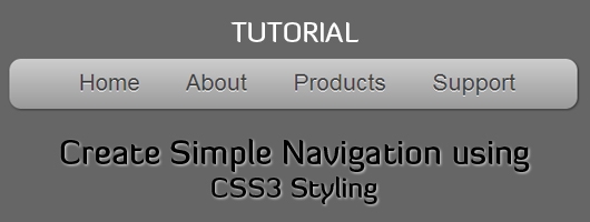
css" type="text/css"/>
DEMO :: Simple Navigation using CSS3 Styling
STEP 3:
Add the following style in the CSS file to give your navigation some clean look.
body{
	background: #666;
    font-family: Helvetica, arial, sans-serif;
}

#nav {
	width: 500px;
	margin: 50px auto;
}

#nav ul {
	float: left;
	list-style-type: none;
	width: 450px;
	height: 44px;

	-moz-border-radius: 10px;
	-webkit-border-radius: 10px;

	background: #e3e3e3;
	background: -moz-linear-gradient(top, #ccc, #999);
	background: -webkit-gradient(linear, left top, left bottom, from(#ccc), to(#999));

	-moz-box-shadow: 1px 1px 3px #333;
	-webkit-box-shadow: 1px 1px 3px #333;
	box-shadow: 1px 1px 3px #333;

	text-shadow: 0 1px 0 white;
}

#nav ul a{
	display: block;
	padding: 10px 20px 10px 20px;
	list-style-type: none;
	float: left;
	color: #454545;
	font-size: 20px;
	text-decoration: none;
}
Applying Shadow:
-moz-box-shadow is used for Mozilla. Syntax is
-moz-box-shadow: x-offset y-offset blur color;
-webkit-box-shadow is used for Webkit. Syntax is
-webkit-box-shadow x-offset y-offset blur color;
box-shadow is used for Standard Browsers. Syntax is
box-shadow: x-offset y-offset blur color;
Applying Gradient:
For Mozilla client gradient is applied using the following syntax
background: -moz-linear-gradient(position of start, from color, to color);
and for Webkit it is
background: -webkit-gradient(type of gradient, position of start, position of stop, from color, to color);
Creating Rounded Corners:
This is one of the most beautiful addition to CSS3. You can create rounded corners with just a two lines of code.
Syntax:
-moz-border-radius: radius size in px;
-webkit-border-radius: radius size in px;
STEP 4:
Let’s add some hover effect. Add the following code in CSS file to get cool hover effect.
#nav ul a:hover{
	display: block;
	padding: 10px 20px 10px 20px;
	list-style-type: none;
	float: left;
	color: #ddd;

	text-shadow: 0 1px 0 black;

	background: #555;
	background: -moz-linear-gradient(top, #444, #555);
	background: -webkit-gradient(linear, left top, left bottom, from(#444), to(#555));
}
Try with different color combination to get exciting results.
You can download my file below for experimenting.
By using our network+ certification and 640-864 e-book facility, you can carry your 642-681 prep solutions anywhere along with you. The 70-681 dumps and E20-322 exam tutorials are also accessible with free downloadable feature.
Very cool css3. Cant wait till all browsers support it fully.
yup, hope we can use it freely after IE9
Great job, Nikhil! And we shouldn’t waiting for the IE9 accept the CSS3. They
And we should not wait for IE9. They, ‘Microsoft’, is that they must adapt to the new standards!
Nice navigation menu. CSS3 seems to be used more and more widely today. Hope all browsers fully support it 🙂
Great article, thanks for sharing.
This is an incredible post. Its amazing to see what CSS3 can do , at the same time its sad a lot of customers still want IE support which sucks at CSS3 big time. I am taking the liberty of adding this article to my CSS aggregator site. Hope you dont mind. 🙂
Lovely post, i had been struggling to find something like this for quite a while. Thanks a lot for sharing. I am going to add it to my CSS aggregator site.
really nice tutoral, thanks for sharing..
Damn!! Its so nice 😀
Nice to read it.
Hello,
this CSS code is great, but i’ve a problem with Internet Explorer.
IE don’t recognize the nav background neither the police.
Does anyone has an idea or a solution?
Of course, i’m not using IE, but so much people ‘re still using it…
Here is my test: http://minecraft-creativecrafts.fr/index%20test.html
Great piece of information here on this website. Keep up the good work and continue providing us more quality information from time to time.
Web Design
Incredible post.Its Good to know about what CSS can do.Thank you for sharing this article.
I do not even understand how I finished up right here,
but I thought this submit used to be good. I do not recognize who you might
be however definitely you’re going to a famous blogger for those who are not already.
Cheers!
Hi,
Nice article .Thanks for providing very useful information about navigation menu.Very clear and helpful for beginners.
Website development company in Indore